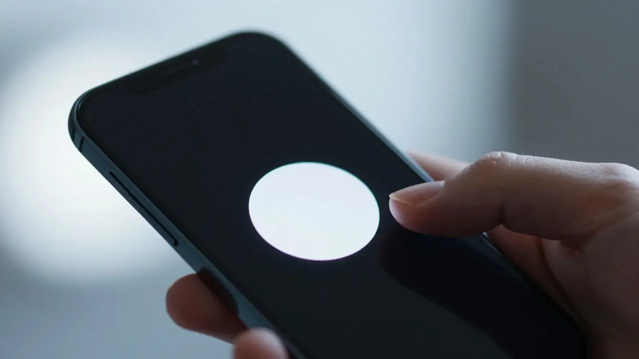

Imagine turning on a new iPhone. You don't see a wall of text explaining what a 'gesture' is. You don't watch a video tutorial. You just slide to unlock, and suddenly, you know how to swipe up from the bottom to go home. That moment of intuitive understanding is not magic; it is the result of decades of rigorous Apple a technology company known for its minimalist hardware and integrated software ecosystems design philosophy. Apple has mastered the art of onboarding the process of guiding new users through initial setup and basic functionality by removing friction rather than adding instruction. Instead of teaching you how to use their products, they design the product so that using it feels like the only logical next step.
The Philosophy of Invisible Education
Traditional software often relies on tooltips, pop-ups, and help menus to explain features. This approach assumes the user is lost and needs direction. Apple flips this assumption. Their core belief is that if a feature requires a tutorial to be understood, the feature itself is poorly designed. This concept aligns with the broader principle of user-centered design a design process that prioritizes the needs, wants, and limitations of end users, where the interface adapts to human cognition rather than forcing humans to adapt to complex interfaces.
This philosophy is rooted in Steve Jobs co-founder of Apple who championed simplicity and intuition in consumer electronics' insistence that technology should disappear into the background of daily life. The goal is not to impress the user with complexity but to remove the barrier between intent and action. When you open the Camera app on an iOS device, there are no labels for 'shutter' or 'focus'. There is simply a large circle. Your thumb knows what to do. This is affordance a visual cue that suggests how an object can be used in action. The button looks pressable; the slider looks draggable. The design speaks before the words do.
Progressive Disclosure: Teaching One Step at a Time
One of the most effective tools in Apple's toolkit is progressive disclosure a design strategy that reveals information gradually as the user becomes more familiar with the system. Imagine trying to learn a car by reading the entire owner's manual before starting the engine. Overwhelming, right? Apple avoids this cognitive load by hiding advanced options until the user actually needs them.
Consider the Control Center on recent iPhones. Initially, you see a simple grid of essential toggles: Wi-Fi, Bluetooth, Airplane Mode, and Brightness. If you want to adjust volume or access music controls, you don't see those buttons immediately. But if you long-press a control, the interface expands to reveal deeper settings. You learned how to access advanced features not because a tooltip told you to, but because the interface responded to your curiosity. This reduces clutter while keeping power available. It respects the novice's need for simplicity and the expert's need for speed.
Motion as a Language
Words are slow. Motion is instant. Apple uses animation not just for aesthetics, but as a primary communication channel. When you delete a photo in the Photos app, it doesn't just vanish. It shrinks and fades away. When you pull down the notification shade, it slides smoothly from the top edge. These movements create a mental model of physical space. You understand that things have weight, position, and continuity.
This technique leverages micro-interactions small, subtle animations that provide feedback on user actions. They confirm that your input was registered without needing a text confirmation message. A checkmark appearing after you save a document tells you success. A shake animation when you type an incorrect password tells you failure. These cues are universal. They bypass language barriers and processing time. By relying on motion, Apple ensures that even users who skim or ignore text can still navigate the system effectively.

Consistency Across the Ecosystem
Apple’s strength isn't just in individual apps; it's in the consistency across its entire ecosystem. If you know how to swipe left to archive an email in Mail, you likely know how to swipe left to mark a message as read in Messages. This cross-platform consistency builds muscle memory. Once a user learns one pattern, they can apply it everywhere else. This is known as pattern matching the cognitive process of recognizing familiar structures to predict outcomes.
By maintaining strict guidelines for Human Interface Guidelines (HIG) Apple's official documentation for designing consistent user experiences across its platforms, the company ensures that third-party developers follow similar rules. While not all apps adhere perfectly, the dominant trend reinforces the idea that swiping, tapping, and pinching behave predictably. This reduces the learning curve for new devices significantly. A user switching from an iPad to a Mac can rely on familiar gestures, even if the hardware form factor changes.
Real-World Examples of Frictionless Setup
Let's look at specific instances where this philosophy shines. When setting up a new MacBook, the initial screens ask minimal questions. Do you want to sign in with your Apple ID? Yes. Do you want to transfer data from your old computer? Yes. The rest happens in the background. No prompts asking about font preferences or desktop icon sizes. Defaults are chosen based on statistical likelihoods and best practices, allowing the user to customize later if desired.
Another example is the App Store. When you download a new game or utility, the app launches directly into its main interface. There is rarely a splash screen with a logo that lingers for five seconds. There is no forced tour of the menu bars. You are dropped into the environment. If you get stuck, the interface provides contextual hints, such as highlighting a button you haven't used yet. This approach trusts the user's intelligence and keeps the momentum going.
Why This Works Better Than Traditional Tutorials
Traditional tutorials suffer from the 'novice problem.' Users tend to skip them because they feel patronizing or time-consuming. Even if they watch, retention is low because passive observation does not equal active learning. Apple’s method forces active engagement. You learn by doing. The risk of error is minimized because the interface prevents catastrophic mistakes during the early stages. For instance, you can't accidentally format your hard drive on a modern Mac because the option is buried deep in System Settings, protected by multiple confirmation steps.
This safety net allows users to explore freely. They can tap things, drag things, and break things (virtually) without fear. This exploratory behavior leads to deeper understanding. Research in cognitive psychology the scientific study of mental processes including perception, memory, and problem-solving supports this: people retain information better when they discover it themselves rather than being told it. Apple designs for discovery, not dictation.
Challenges and Limitations
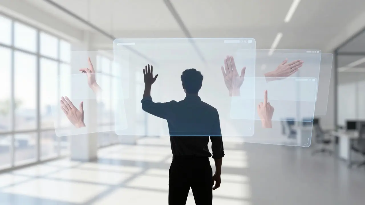
Is this approach perfect? Not entirely. Critics argue that it can be confusing for users coming from different ecosystems, such as Android or Windows. The lack of explicit labels can sometimes lead to frustration if a user expects a standard button but finds a gesture instead. Additionally, as features become more complex, the line between 'intuitive' and 'obscure' blurs. Some users prefer clarity over cleverness. They would rather see a label that says 'Edit Profile' than guess that tapping their avatar will take them there.
However, Apple mitigates this by providing accessible options and clear icons. The key is balance. The interface must be simple enough for novices but powerful enough for experts. Achieving this balance requires constant iteration and testing. Apple invests heavily in usability testing, observing real users interact with prototypes to identify points of confusion before release.
Key Takeaways for Designers
- Trust the User: Assume users are intelligent and capable. Avoid over-explaining basic concepts.
- Use Affordances: Design elements that visually suggest their function (e.g., buttons that look clickable).
- Leverage Motion: Use animation to guide attention and confirm actions without text.
- Apply Progressive Disclosure: Hide advanced options until they are needed to reduce cognitive load.
- Maintain Consistency: Ensure patterns repeat across your product suite to build muscle memory.
- Default Wisely: Choose sensible defaults so users can start working immediately without configuration.
Applying These Principles to Your Product
You don't need to make hardware to adopt these strategies. Whether you're building a SaaS platform, a mobile app, or a web service, you can apply these lessons. Start by auditing your current onboarding flow. Are there any steps that require a tooltip to explain? If so, redesign the interface to make the action self-evident. Look for opportunities to replace text instructions with visual cues or animations. Test your product with new users and observe where they hesitate. Those hesitation points are your design opportunities.
Remember, the goal is not to eliminate all thinking, but to eliminate unnecessary thinking. Let the user focus on their task, not on figuring out how to use your tool. When you achieve that state, you haven't just created a better product; you've created a seamless experience that feels effortless. And that is the true hallmark of great design.
What is the main difference between Apple's onboarding and traditional tutorials?
Traditional tutorials explicitly teach users through text, videos, or guided tours. Apple's approach relies on implicit learning through intuitive design, motion, and affordances, allowing users to learn by interacting with the interface naturally.
How does progressive disclosure help in user onboarding?
Progressive disclosure reduces cognitive overload by showing only essential features initially and revealing advanced options as the user demonstrates familiarity. This keeps the interface clean for beginners while remaining powerful for experts.
Can non-Apple companies use these design principles?
Yes, these principles are universal. Any product can benefit from reducing friction, using consistent patterns, leveraging motion for feedback, and trusting the user's ability to explore intuitively.
What role does consistency play in Apple's design philosophy?
Consistency allows users to transfer skills from one app or device to another. By adhering to strict Human Interface Guidelines, Apple ensures that gestures and interactions behave predictably across its ecosystem, reducing the learning curve for new products.
Why might some users find Apple's design frustrating?
Users accustomed to explicit labels or standard desktop metaphors may find gesture-based navigation or hidden menus confusing. The lack of visible options can feel opaque, requiring trial and error to discover certain functions.