Wolf and Hare

Tag: text hierarchy

Typography Hierarchy in Apple Apps: Sizes, Leading, and Contrast Strategies

Typography Hierarchy in Apple Apps: Sizes, Leading, and Contrast Strategies
  • Elias Voss
  • Elias Voss

20/01
0

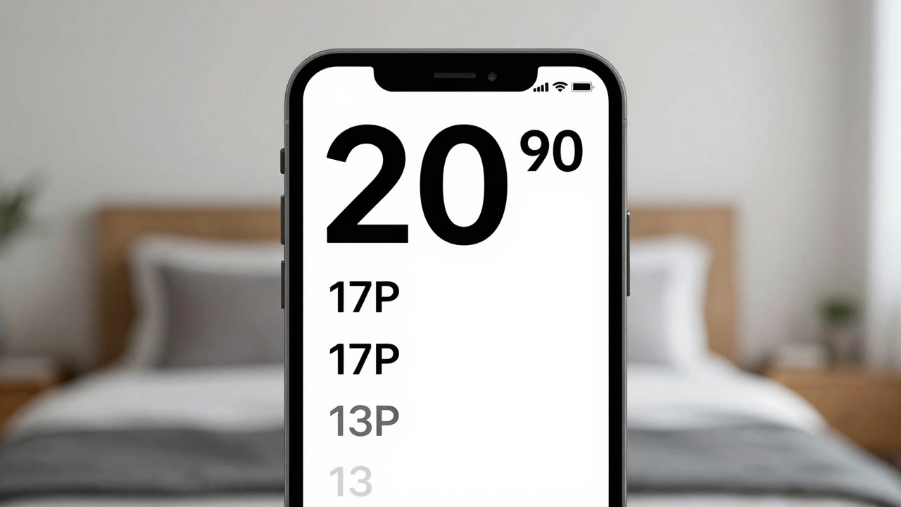
Apple's typography hierarchy uses San Francisco font, Dynamic Type, and precise sizing to guide users through apps. Learn how size, leading, weight, and contrast work together to create clear, accessible interfaces.

Read More...

Categories

  • Design & Technology (104)
  • Retail Design (4)
  • Design Tools (2)
  • Technology (2)
  • Design & Development (1)

Popular Articles

State Restoration on Apple: Seamless Continuity Across Sessions and Devices

Jan 19 2026

Designing for Input Diversity: Touch, Pencil, Keyboard, and Voice on Apple Devices

Feb 14 2026

Industrial Design at Apple in the 1990s: Brunner, Kawasaki, and the Birth of In-House Design

Jan 6 2026

Building Apple Widgets: Sizes, Layout Grids, and Legibility Standards

Jan 3 2026

iPad Typography Choices: SF Pro Display and Text Pairings for Legibility

Jan 24 2026

Tags

  • Liquid Glass
  • Apple design
  • Apple typography
  • Apple ecosystem
  • San Francisco font
  • unboxing experience
  • Apple packaging
  • iOS 26
  • inclusive design
  • Apple accessibility
  • Jony Ive
  • Apple design philosophy
  • Apple Watch design
  • Apple retail design
  • Apple Intelligence
  • industrial design
  • Dynamic Type
  • Apple interface design
  • Apple design system
  • Liquid Glass design
Wolf and Hare

© 2026. All rights reserved.