Wolf and Hare

Tag: smartwatch screen efficiency

Square vs. Round Watch Displays: Why Apple Chose Rectangular for Better Readability

Square vs. Round Watch Displays: Why Apple Chose Rectangular for Better Readability
  • Elias Voss
  • Elias Voss

8/01
0

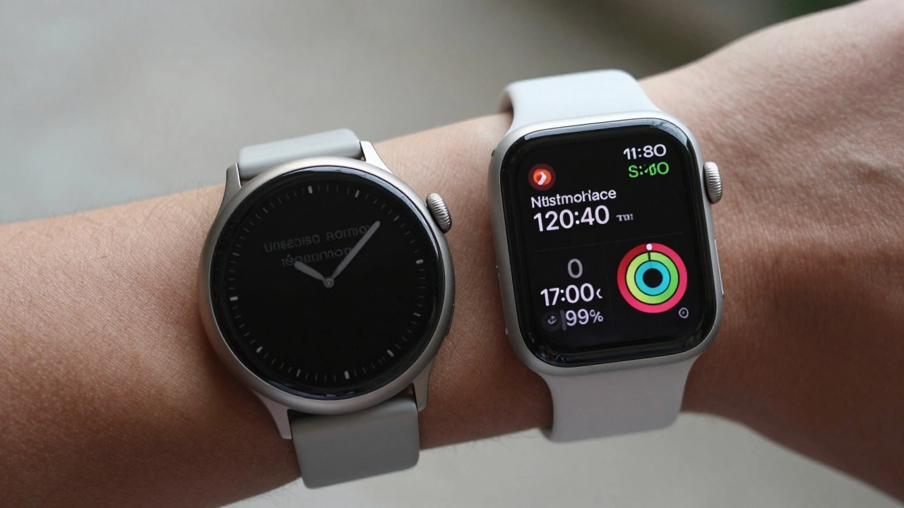
Apple chose a rectangular watch face not for style, but because it shows more information clearly, uses screen space efficiently, and works better with real-world data like messages, calendars, and health stats. Round watches waste pixels and force scrolling. The math doesn’t lie.
Read More...

Categories

  • Design & Technology (104)
  • Retail Design (4)
  • Design Tools (2)
  • Technology (2)
  • Design & Development (1)

Popular Articles

Consistency Across Apple Product Lines: How Packaging Builds an Ecosystem Signal

Dec 31 2025

Hartmut Esslinger and Frog: How Snow White Redefined Apple’s Design DNA

Feb 7 2026

Translucent Plastics at Apple: How Material Design Communicates Approachability and Playfulness

Jan 18 2026

Density Decisions: How Apple Adapts Typography from iPhone to iPad to Mac

Feb 3 2026

App Ecosystem Fit: How to Build Third-Party Apps That Feel Native on Apple

Jan 4 2026

Tags

  • Liquid Glass
  • Apple design
  • Apple typography
  • Apple ecosystem
  • San Francisco font
  • unboxing experience
  • Apple packaging
  • iOS 26
  • inclusive design
  • Apple accessibility
  • Jony Ive
  • Apple design philosophy
  • Apple Watch design
  • Apple retail design
  • Apple Intelligence
  • industrial design
  • Dynamic Type
  • Apple interface design
  • Apple design system
  • Liquid Glass design
Wolf and Hare

© 2026. All rights reserved.