Wolf and Hare

Tag: iOS typography

Typography Testing on Apple Devices: Contrast, Crispness, and Rendering

Typography Testing on Apple Devices: Contrast, Crispness, and Rendering
  • Elias Voss
  • Elias Voss

15/01
0

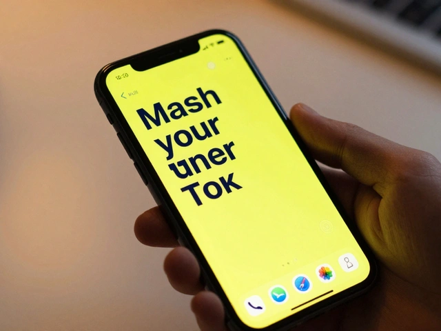
Learn how Apple's San Francisco font system ensures crisp, readable text across all devices. Discover essential testing methods for contrast, rendering, and accessibility on iOS, iPadOS, and macOS.

Read More...

Categories

  • Design & Technology (118)
  • Retail Design (4)
  • Design Tools (2)
  • Technology (2)
  • Design & Development (1)

Popular Articles

How Apple Measures Design Impact: Quality, Adoption, and Ecosystem Fit

Jan 31 2026

Headlines vs. Body Text on Apple: Why SF Pro Display and SF Pro Text Are Designed Differently

Jan 16 2026

Iconography and Labels for AI on Apple: Clarity Without Hype

Mar 2 2026

App Ecosystem Fit: How to Build Third-Party Apps That Feel Native on Apple

Jan 4 2026

iPad Typography Choices: SF Pro Display and Text Pairings for Legibility

Jan 24 2026

Tags

  • Apple design
  • Apple typography
  • Liquid Glass
  • Apple ecosystem
  • unboxing experience
  • San Francisco font
  • Apple packaging
  • iOS 26
  • Apple accessibility
  • Apple Intelligence
  • inclusive design
  • Jony Ive
  • Apple design philosophy
  • Apple interface design
  • Apple Watch design
  • Apple retail design
  • industrial design
  • Dynamic Type
  • Apple design system
  • Liquid Glass design
Wolf and Hare

© 2026. All rights reserved.