Wolf and Hare

Tag: iOS hierarchy

How Apple Uses Motion and Depth to Show Interface Hierarchy

How Apple Uses Motion and Depth to Show Interface Hierarchy
  • Elias Voss
  • Elias Voss

28/01
0

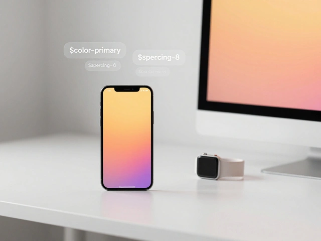
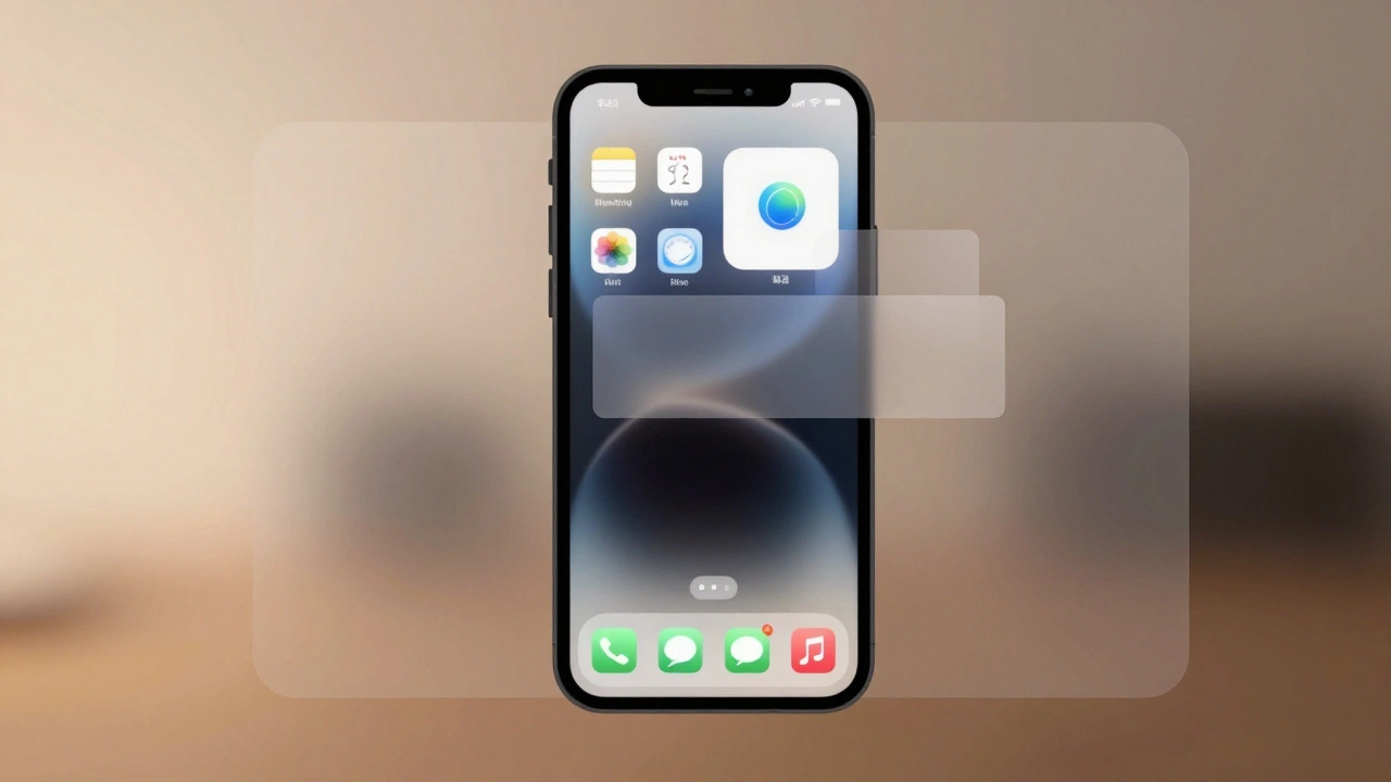
Apple uses motion and depth-not color or size-to silently guide users through interfaces. By blending subtle shadows, fluid transitions, and translucent layers, Apple makes hierarchy feel intuitive, not forced. This approach reduces clutter and keeps focus on content.

Read More...

Categories

  • Design & Technology (118)
  • Retail Design (4)
  • Design Tools (2)
  • Technology (2)
  • Design & Development (1)

Popular Articles

Thermal Design in MacBook: How Apple Achieves Quiet Performance Without Sacrificing Thin Form

Jan 19 2026

Strap Mechanisms by Design: Why Quick Release Is the New Standard in Watch Design

Feb 8 2026

Contextual Menus and Peek: How Apple Unified Touch Interactions Across iOS and iPadOS

Feb 22 2026

Why iPhone Edges, Rims, and Bezels Matter for Touch Accuracy

Dec 29 2025

Designing App Icons for Apple Ecosystem: Layered Depth and Brand Consistency

Jan 22 2026

Tags

  • Apple design
  • Apple typography
  • Liquid Glass
  • Apple ecosystem
  • unboxing experience
  • San Francisco font
  • Apple packaging
  • iOS 26
  • Apple accessibility
  • Apple Intelligence
  • inclusive design
  • Jony Ive
  • Apple design philosophy
  • Apple interface design
  • Apple Watch design
  • Apple retail design
  • industrial design
  • Dynamic Type
  • Apple design system
  • Liquid Glass design
Wolf and Hare

© 2026. All rights reserved.