Wolf and Hare

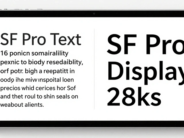
Tag: high-contrast design

Apple Watch Accessibility Guide: VoiceOver, Taptic Time, and High-Contrast Settings

Apple Watch Accessibility Guide: VoiceOver, Taptic Time, and High-Contrast Settings
  • Elias Voss
  • Elias Voss

24/05
0

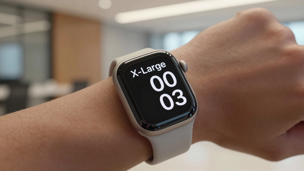
Learn how to use Apple Watch accessibility features like VoiceOver, Taptic Time, and high-contrast design. A practical guide for blind and low-vision users to navigate watchOS effectively.

Read More...

Categories

  • Design & Technology (184)
  • Retail Design (8)
  • Design Tools (6)
  • Design & Development (6)
  • Technology (3)

Popular Articles

Typography Testing on Apple Devices: Contrast, Crispness, and Rendering

Jan 15 2026

How Liquid Glass Scales: From Apple Watch Controls to Mac Sidebars

Jan 27 2026

How Apple Maintains Design Taste at Scale: The Curatorial Secret

May 4 2026

Minimalism in Apple Retail: How Wood, Stone, and Open Plans Define a Brand

Jan 29 2026

Luxury Without Excess: How Apple Mastered Premium Minimal Packaging

Apr 7 2026

Tags

  • Liquid Glass
  • Apple design
  • Apple typography
  • Apple ecosystem
  • inclusive design
  • Apple Human Interface Guidelines
  • Apple Intelligence
  • user experience
  • Apple design philosophy
  • unboxing experience
  • Apple packaging
  • iOS 26
  • San Francisco font
  • Apple accessibility
  • Apple industrial design
  • Jony Ive
  • industrial design
  • Apple retail design
  • Dynamic Type
  • Apple interface design
Wolf and Hare

© 2026. All rights reserved.