Wolf and Hare

Tag: body text font

Headlines vs. Body Text on Apple: Why SF Pro Display and SF Pro Text Are Designed Differently

Headlines vs. Body Text on Apple: Why SF Pro Display and SF Pro Text Are Designed Differently
  • Elias Voss
  • Elias Voss

16/01
0

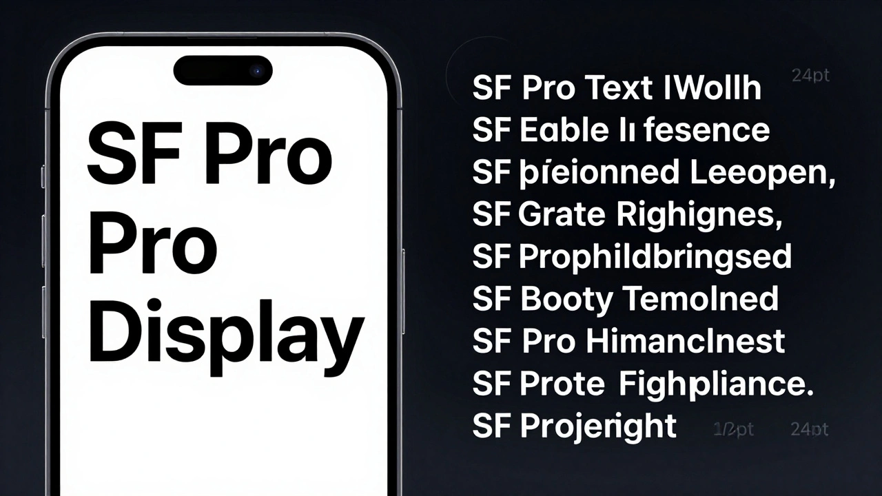
Apple uses two different versions of its San Francisco font-SF Pro Display for headlines and SF Pro Text for body copy. Each is optimized for its job: impact vs. readability. Here’s how and why.

Read More...

Categories

  • Design & Technology (104)
  • Retail Design (4)
  • Design Tools (2)
  • Technology (2)
  • Design & Development (1)

Popular Articles

Designing for Input Diversity: Touch, Pencil, Keyboard, and Voice on Apple Devices

Feb 14 2026

Reducing Plastic in Apple Packaging: Material Trade-Offs and Feel

Feb 7 2026

Why Apple Watch Uses SF Compact: The Typography Behind Small-Scale Legibility

Dec 23 2025

Testing Liquid Glass in Prototypes: Blur Layers and Parallax Simulation

Jan 31 2026

Thermal Design in MacBook: How Apple Achieves Quiet Performance Without Sacrificing Thin Form

Jan 19 2026

Tags

  • Liquid Glass
  • Apple design
  • Apple typography
  • Apple ecosystem
  • San Francisco font
  • unboxing experience
  • Apple packaging
  • iOS 26
  • inclusive design
  • Apple accessibility
  • Jony Ive
  • Apple design philosophy
  • Apple Watch design
  • Apple retail design
  • Apple Intelligence
  • industrial design
  • Dynamic Type
  • Apple interface design
  • Apple design system
  • Liquid Glass design
Wolf and Hare

© 2026. All rights reserved.