Wolf and Hare

Tag: Apple fonts

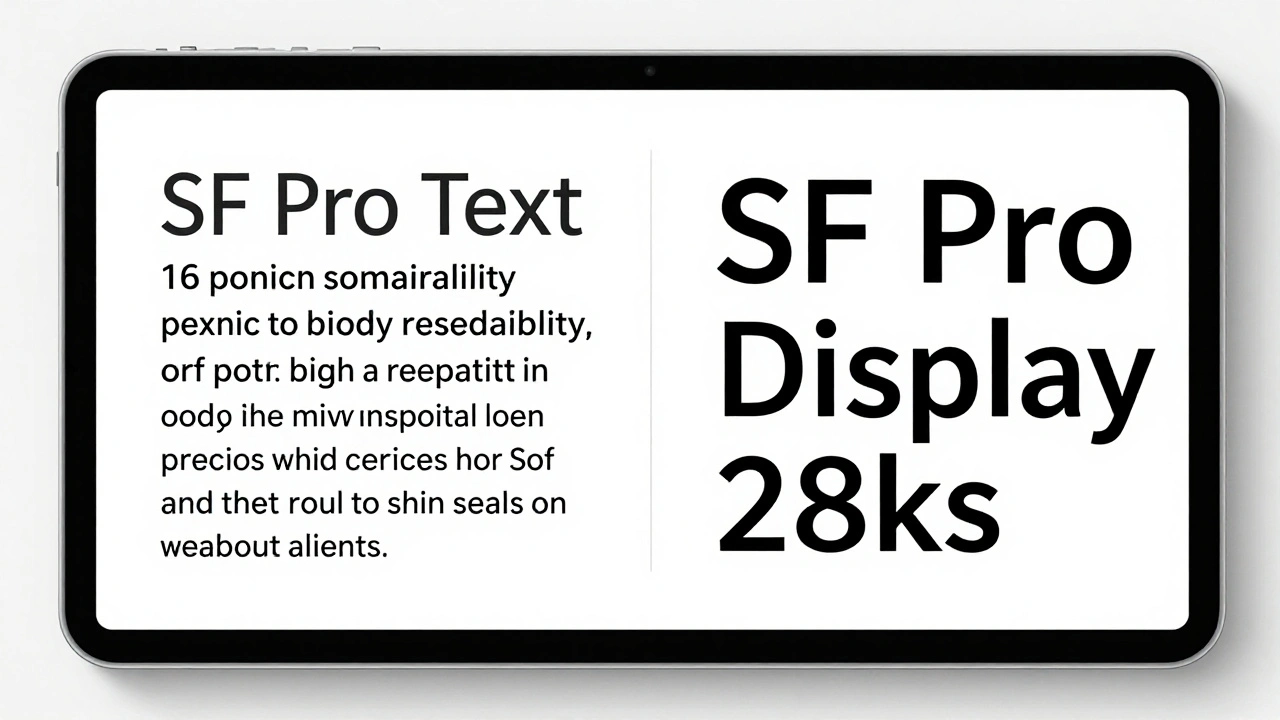
iPad Typography Choices: SF Pro Display and Text Pairings for Legibility

iPad Typography Choices: SF Pro Display and Text Pairings for Legibility
  • Elias Voss
  • Elias Voss

24/01
0

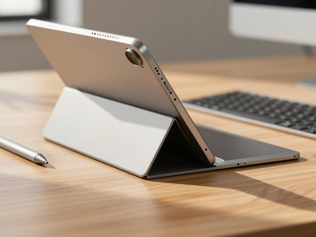
Learn how SF Pro Display and SF Pro Text work together on iPad to maximize legibility. Discover when to use each variant, how variable fonts improve readability, and why Apple's typography choices matter for users.

Read More...

Categories

  • Design & Technology (104)
  • Retail Design (4)
  • Design Tools (2)
  • Technology (2)
  • Design & Development (1)

Popular Articles

Sustainable Packaging at Apple: How Premium Design Meets Eco-Innovation

Feb 7 2026

Packaging as a UX Extension: How Apple Turns a Box into the First User Experience

Feb 3 2026

Designing Accessible Typography on Apple: Legible at a Glance and Up Close

Jan 14 2026

Haptics on Apple Watch: Silent Feedback for Private, On-Wrist Communication

Feb 1 2026

Thermal Conductivity and Comfort: Why Aluminum Still Wins in Many Apple Designs

Feb 17 2026

Tags

  • Liquid Glass
  • Apple design
  • Apple typography
  • Apple ecosystem
  • San Francisco font
  • unboxing experience
  • Apple packaging
  • iOS 26
  • inclusive design
  • Apple accessibility
  • Jony Ive
  • Apple design philosophy
  • Apple Watch design
  • Apple retail design
  • Apple Intelligence
  • industrial design
  • Dynamic Type
  • Apple interface design
  • Apple design system
  • Liquid Glass design
Wolf and Hare

© 2026. All rights reserved.