Tag: accessible color systems
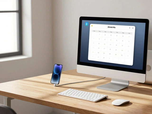
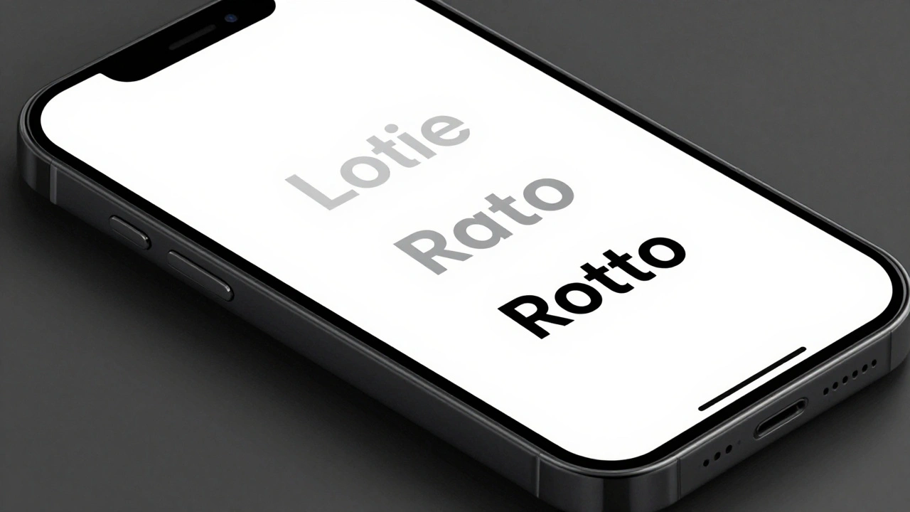
Creating Accessible Color Systems for Apple: Contrast Ratios and System Tints

18/04
0
Learn how to build accessible color systems for Apple platforms using WCAG contrast ratios, system tints, and the Human Interface Guidelines for iOS and visionOS.